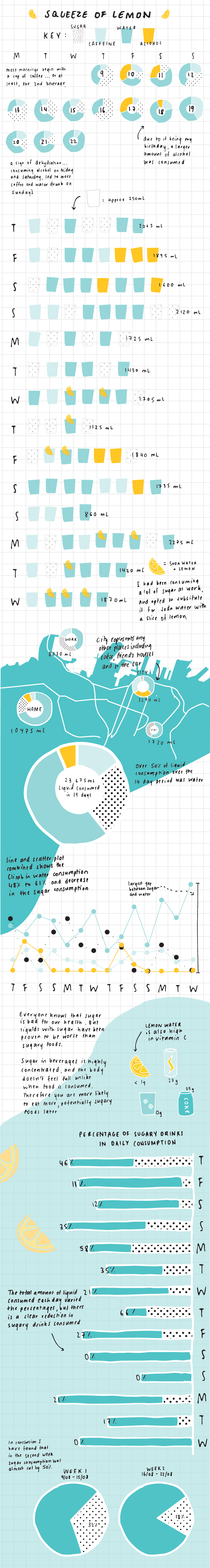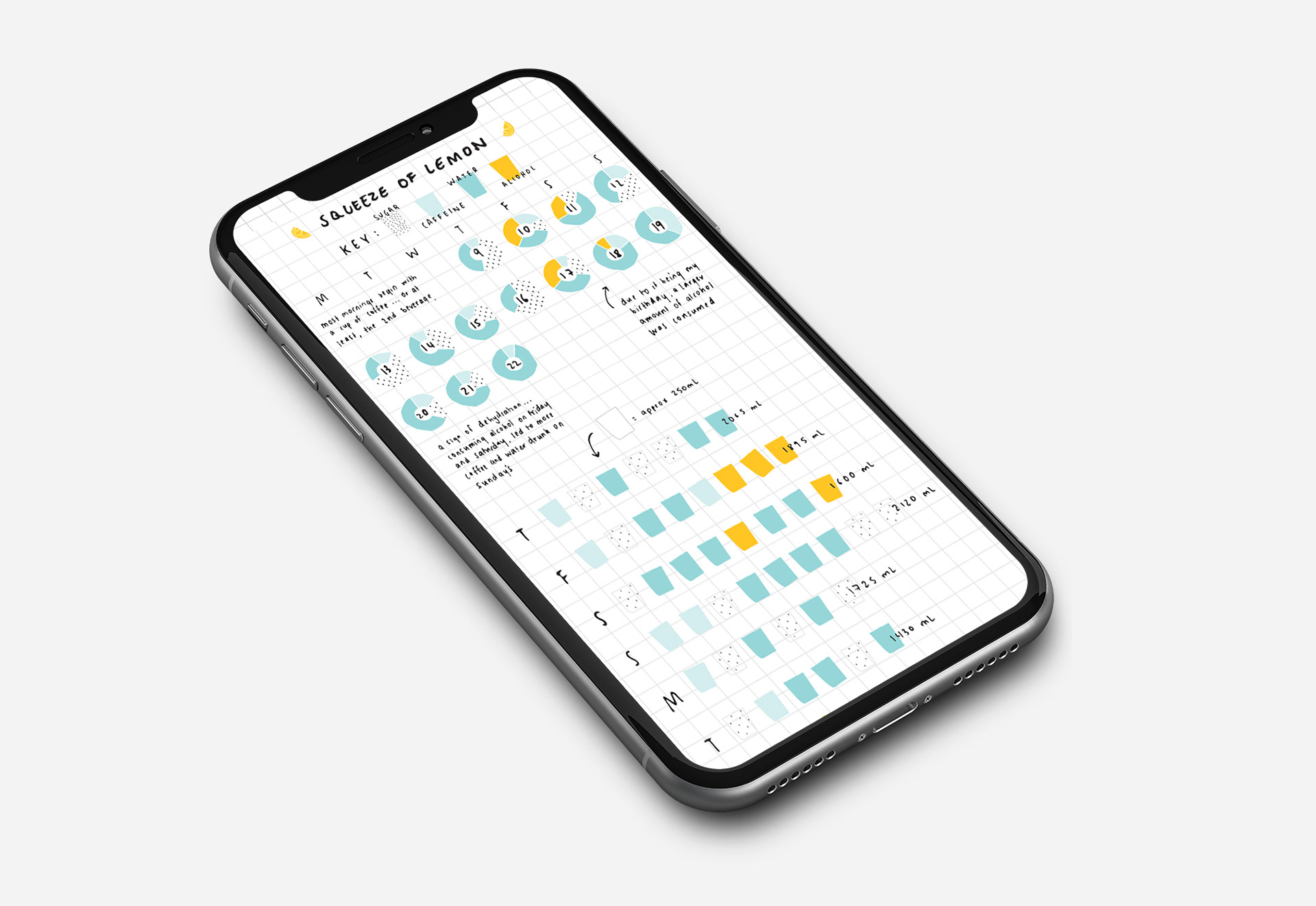
Based around a journal of our consumption of liquid, we were tasked with the creation of a scrollable infographic for a phone. Combining data visualisations, illustration, research and type I created a hand drawn, journal like infographic with a consistent key.
I narrated that over the two weeks of data collection, I cut down on liquid sugar consumption by almost 50%. This story was told through calendars, pictograms, maps and some basic graphs.
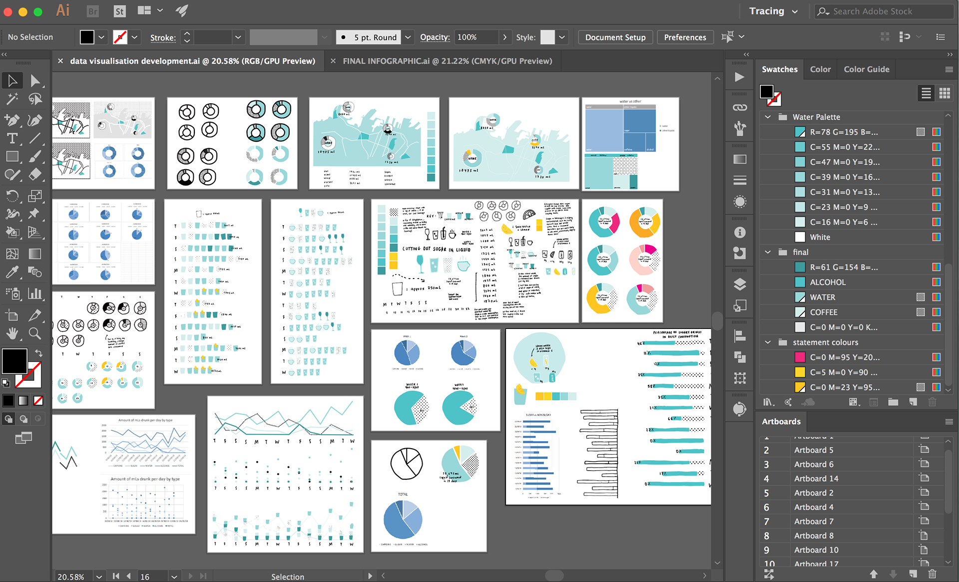
The process was heavily made in illustrator using art boards that helped me visualise the combinations of individual elements as well as the use of image trace for the hand done elements.